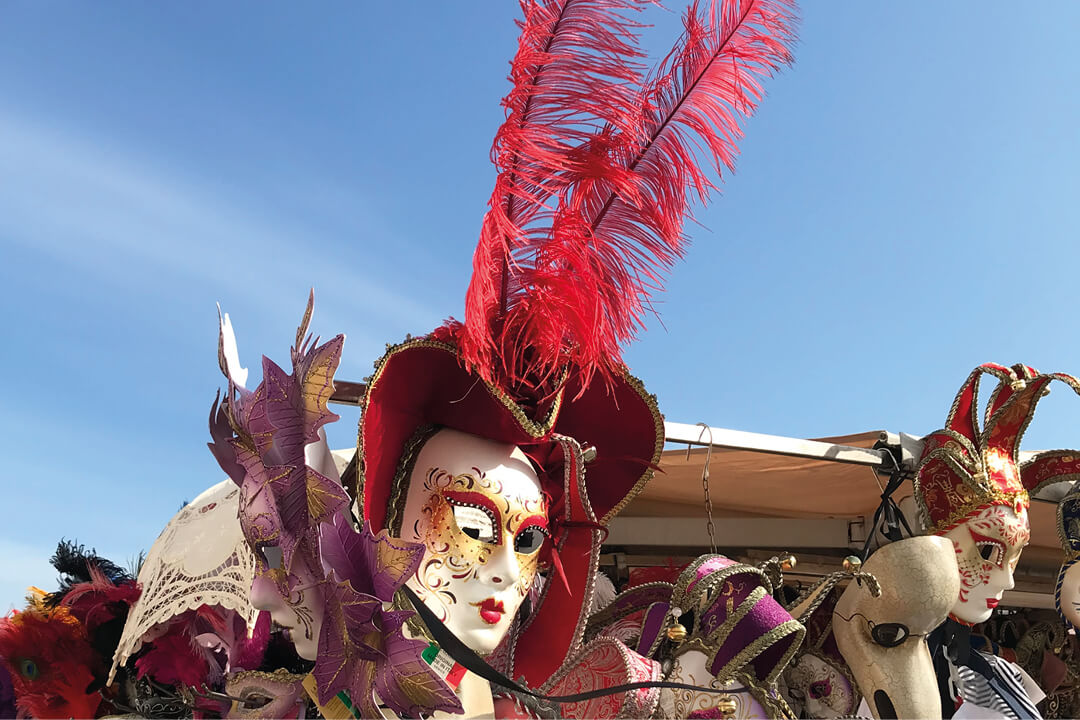
Very Peri is the color for 2022
A new color for a new time
Regularly in December, Pantone, a global institution for color standardization, announces the trend color of the year. For 2022, the color is Very Peri.
Never heard of this color? No wonder. The color combination is new. Pantone was of the opinion that none of the previous colors fit to express the current zeitgeist.
The color for the digitized world
The color institute Pantone describes the new color Very Peri as a blue color with reddish-purple undertones. The color is meant to symbolize the combination of real life and digital space.
According to Pantone, in addition to current fashion trends, the trend researchers were strongly influenced by the developments and thoughts of the Metaverse, a possible further development of the Internet towards a platform in which the real world and the virtual world are increasingly connected.
What used to play in science fiction films and was tried out on the Second Live platform, on which people let their avatars act, is a topic that should not be underestimated in Silicon Valley and not only there.
Escape from reality?
You don’t have to like the color Very Peri. However, it is a logical development in times when we are all spending more and more time in the digital space, when non.fungible tokens represent tradable works of art and the maybe not so nice view from the apartment can be replaced with a look into an illusory world, which can either represent a beach in Puglia or a snowy landscape in the Swiss Alps.
The year before, Pantone had bet on a tie with its color choice for 2021. When nobody could really assess how the pandemic year 2021 would turn out, a fresh, bright, optimistic yellow and an almost neutral-looking gray were the colors of the year.
It could be a hopeful, optimistic year. But maybe not. In hindsight, a wise decision.
In December 2019, at a time when COVID-19 was commonly associated only with the Chinese city of Wuhan, a classic blue was chosen as the 2020 color of the year.
A color that, according to Pantone, represents “the transition from day to night” and evokes “the sea and the desire for contemplative rest”. The choice spoke of the longing for “pause, security and clarity” in a world that is characterized by major upheavals and uncertainties.
How is the color of the year actually chosen?
The color of the year has been determined by Pantone for over 20 years. A team of experts surveys color trends in fashion, design, film, technological developments, inspiration from nature and contemporary art over the course of a year and, each December, announces the color for the following year. In previous years it was the colors Living Coral (2019), Ultra Violet (2018) and Greenery (2017).
Pantone justifies the choice of color with the prevailing zeitgeist. In 2016, for example, light blue and light rosé were declared the colors of the year for the first time. This was intended to give expression to the issue of gender equality.
Reminiscent of the sky in classic paintings, the 2020 Color of the Year was more of a pipe dream than reality. In a world heavily influenced by political egomaniacs, seemingly insoluble political power struggles, wars and increasing environmental destruction, the color classic blue seemed like a slightly naïve but understandable wish for a more promising, calmer future after all.
Valuable light construction
Colors play a key role in brand perception. The turquoise light blue of the Tiffany company was specified by Pantone at the time to make it appear identical worldwide. The shade was chosen by company founder Charles Lewis Tiffany and bears the Pantone color code name 1837 Blue; Tiffany was founded in 1837.
The color works to this day and the light blue of the Tiffany packaging boxes conjures up a radiant smile on the recipient. Because even if the piece of jewelery packaged inside doesn’t arrive – at Tiffanys the recipient can be sure of finding an attractive replacement in exchange.
The purchase of Tiffany & Co. in October 2020 was worth 15.8 billion euros to the luxury group LVMH (Moet Hennessy Louis Vuitton SE). LVMH’s rationale for its acquisition strategy reads “The blue Tiffany box is seen around the world as an icon of noble and desirable things”.
Many beverage brands attach great importance to their own Pantone color. The champagne brand Piper-Heidsieck has a Pantone-specified Piper-Heidsieck red. Pantone also specified the color for Tanqu’s Gin Flor de Sevilla Tanqueray, which, with its bright orange, is said to be reminiscent of the house facades of the Spanish city of Seville and the characteristic bitter orange marmalade.
