Forget all the cautious advice about the color on your walls
An expressive color brings warmth and atmosphere to a room
Caution color
If you look into illuminated living rooms in the evening hours, you will see predominantly a light shade on the walls. On closer inspection, they are different shades of white and light gray; sometimes there is a pastel-like pink or a cream tone.
As a result, the walls look rather neutral.
Nothing wrong with that, we all love the white cube effect of many galleries.
There are many prejudices against a more dominant color design of the walls or even the use of wallpaper with an unusual decor: “The room could become a cave”, “The decor could seem overwhelming”, “Then the entire interior would have to be changed”.
Many who mentally play with the thoughts of daring more color in their own home, ultimately decide again for a rather inconspicuous shade with which you can not go wrong.
If not now color, when
We would like to encourage you to choose a strong color, especially this winter. What can happen? The worst case scenario is repainting.
From our own experience, we are sure you will not regret an unusual color choice in your home, but will develop a desire for even more color or pattern.
The best way to color
Various guides have adjusted to the fact that little courage to use color in the home and offer extensive suggestions: The best color for the living room. What color for a room that is on the north side? The best colors for small spaces, the best colors for children’s rooms. The choice of colors according to Feng Shui, etc.
Forget this well-meaning advice. There are really only a few basic things to keep in mind:
Your personal color memory
Start to look carefully at the color on the walls in all places you feel in what color environment you feel comfortable.
Take a careful look at the walls in the restaurant, hotel, cafe, museum, historic houses, friends’ apartments. Your gut will tell you if an oxblood red, a fresh green or a dark brown shade will do you good or if something inside you is resisting it.
You don’t need to pay attention to trends when it comes to colors. If you’ve ever searched a hotel reservation system for a room in a city where a major trade show is currently taking place, you’ll see endless hotel facilities that follow color trends and quickly get fed up.
Paint manufacturer Little Greene says “Some of our most popular colors are also the oldest. For example, Celestial Blue was originally discovered on a colorcard from 1807”.
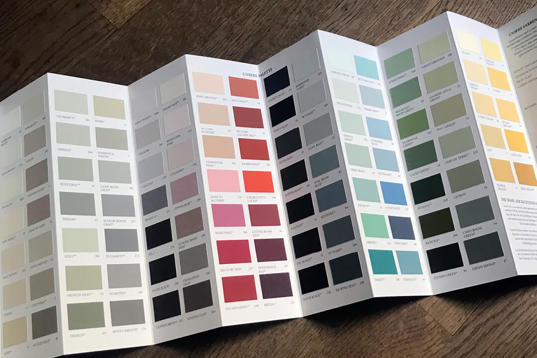
Color cards for initial orientation
All paint manufacturers offer their color selection online. This is helpful for a first orientation in which direction it could go. On-screen sample rooms also sharpen your individual color memory, as you instinctively select which color schemes appeal to you and which leave you cold in a matter of seconds.
If the manufacturer seems to have something suitable in the program, it is worth ordering a color fan in paper form as a first step.
The assessment of a color on the screen alone is hardly possible, since the reproduction of a color is highly dependent on the respective calibration of your screen and can therefore vary greatly.
The color fans show color families and make it possible to hold different colors against each other in order to assess their combination.
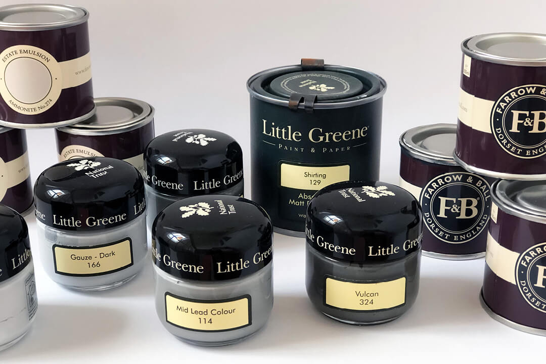
Sample color pots for decision
To get a realistic impression of the color in the future room, sample color pots, which almost every supplier offers, are essential.
The actual color tone can be judged only in the painted state on the future wall. Many a color consideration that looked promising on the screen or on the color chart will thus come to nothing. Other colors, on the contrary, will arouse your interest.
Color swatches on the wall allow you to assess the color in different lighting conditions: In the morning, in the afternoon, on a gloomy rainy day or in bright sunshine.
It’s not that unusual to order more after the first sample color pots. Choosing an individual color is a process.
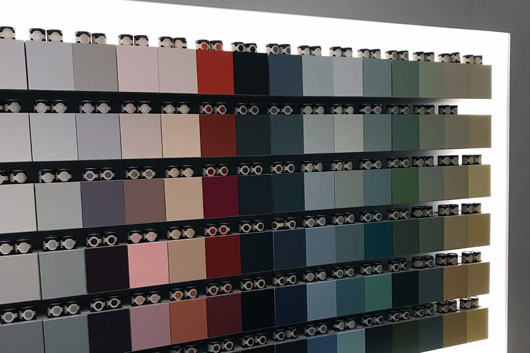
If there is a manufacturer’s showroom near you, it is definitely worth a visit, especially if you have already tried a few colors on your wall. A good color consultant will recognize during the conversation how you feel about the previous color samples and can make an even more suitable or exceptionally new suggestion.
Seeing the entire color palette on site on sample cards or in sample paint jobs takes you another step further in your selection. But again, the colors are applied to different materials in the showroom and the light there does not match your living situation.
When you leave the showroom with more sample color pots, the optimal shade will most likely be there.
All or nothing
Your courage to use an unusual color will hopefully not leave you now, deciding to paint only one wall with it. That would be too bad, because the color hardly has a chance to actually work that way.
Color professionals sometimes dip the entire room in the new color, including the ceiling, decorative moldings and doors. A powerful special effect that can be used to create a specific spatial effect.
In most cases, doors and door frames, as well as the flaps of windows, in a neutral shade such as a shade of white or in a deliberately contrasting hue is a wonderful effect to make the more dominant color shine.
The reward
A strong color will give a whole new atmosphere to the room or rooms in your home. Suddenly a plain white candle in front of the wall becomes a painting and an autumnal berry bush looks like a sculpture.
The art on your walls will also look completely new. A good opportunity to hang the artwork once again.

The view of the island
Paints are available at any hardware store, with the promise of being able to mix any shade imaginable. One possible solution – we recommend looking to the UK when it comes to color.
There is a color tradition there that works with a very high proportion of pigments. This not only has the advantage that the colors have great depth. It has the further advantage of pleasantly changing the feeling of space.
With the many hours spent in one’s own home, especially in the cooler seasons, whether in the home office, kitchen or living room, this feel-good factor should not be underestimated.
The range of color in the UK is extensive. There are specialist suppliers who, for example, specialize in wall paints for historic houses.
If you do not have a lock, we recommend the two manufacturers Little Greene and Farrow & Ball. We have had very good experiences with both of them for years in terms of colors, service and feeling of space.
Both cooperate with manufacturers of tiles, which can be an interesting aspect, if you want to match tiles and wall color.
The small owner-managed company from Wales is known for its paints and wallpapers, many of which are derived from historical models in close collaboration with the British National Trust and also look fantastic in any modern apartment.
Little Greene has a company history dating back to 1773 and prides itself on current ecological standards, in the production of its paints.
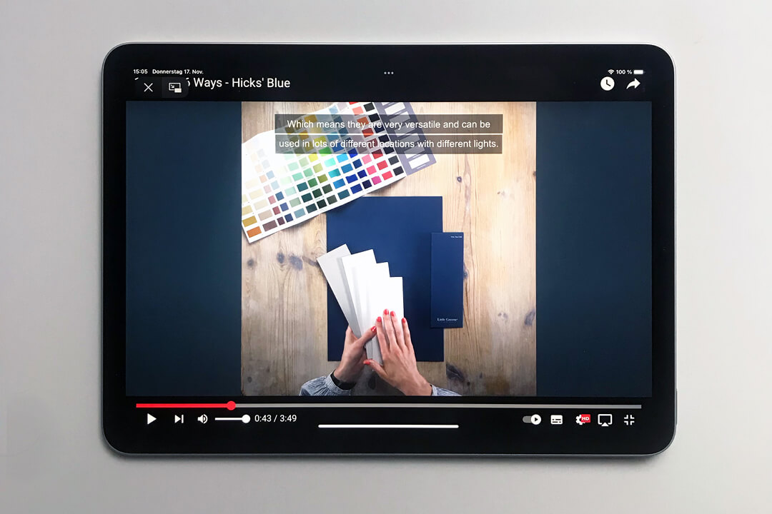
A video by Little Greene, in which the color Hicks’ Blue and six possible combinations of the color are presented, makes you want to use a strong color. You can find the video here.
The better-known company has an extensive web presence and several showrooms.
In 2021, the English company Farrow & Ball was acquired by the global paint company Hempel, which is based in Denmark. Jørgen Christian Hempel, the company’s founder, began specializing in marine paint in 1915. His anti-fouling paints are still appreciated by yacht owners today.
Many a wind turbine you pass, many a building, many ships and containers worldwide are painted with special paints from Hempel.
Also the Breclav Bridge, which connects Austria and the Czech Republic across a river. A beautiful, hopeful picture of a new bridge, as we would like to see in many places of the future, rebuilt Ukraine.
 Breclav bridge, image credits © Hempel
Perhaps with our experiences we could also build you a small bridge to an even more atmospheric, warm home with color. It would be our pleasure.
#Advertising #ProductPlacement #IndependentRecommendation #BecauseWeLoveIt
Photographs © GloriousMe
